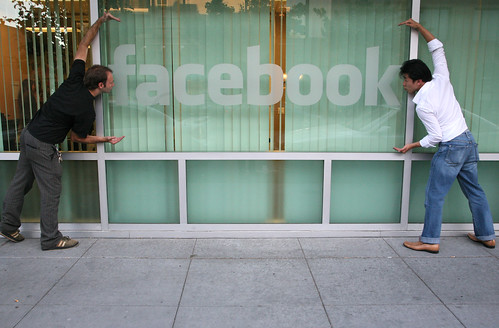
"(Insert name of group of people) hates the new Facebook: Bring it back (some sort of threat)"Picture from Laughing Squid
For example:
"People with exact height of 5 foot 6 inches hates the new Facebook: Bring it back or else!"In my opinion, newer things generally takes time to get use to, but after people get use to it, it is pretty tight. Picasso was quoted to say that the internet would never amount to anything, I wonder if he was right.
This new Facebook (which I shall call NFB from now on) gives a much cleaner look, but people complain it to be clustered due to the tabs. Face it, tabs are the new thing. Chances you are browsing with tabs right now on your internet browser and I bet that you love it. Likewise this new tab organization IS much more organized. Why? Do you know those people whose profile page is so clogged up with applications that it's impossible to even do a quick look up for an email address? Problem solved, put the apps in a seperate tab as not to interfere with other processes.
Using tabs does bring up a problem, it might feel a bit sluggish. Sometimes, the page might slow down a bit. Yes, that's somewhat a nuissance, but it's not going to be a problem. In a month or two, Firefox 3.1 is going to come out with an AWESOME upgrade to its javascipt handling capabilities. Or heck, just use Chrome for right now... (and if you're still using Internet Explorer for Facebook... you can't complain about it being slow, the problem is IE).
By -=Ben=-
Don't you love the part where you can comment on nearly everything? Status, things you did, relationship changes, sex changes... you know. What about the ease of commenting on the notes/posted items you have now? Can't really do this with the old Facebook can you? Don't you think this helps "promote social interactions"?
So what about the starting page? Personally, I think that, with the commenting feature, is the greatest improvement. No longer do I have to start starring an unorganized start screen. It is clean, nice, trim... what I consider to be James Bond like compared to Austin Powers (the ugly parts). This start page utilizes pretty much the entire width and height of the page and allows for quick comments for a quick strike.
Still not convinced? Blah... I give up on you.
Or you can go back to the old facebook from the directions here:
What I want on Facebook
- Integration: I want to be able to update my Facebook status and Twitter at once. I want to be able to "sync" Google Calendar with Facebook events. I want to be able to comment on Facebook my photos on Flickr, comment on YouTube stuff from Facebook... you get what I'm saying. (The killer thing? AIM with Facebook Chat...)
- Better note support: After starting a Facebook account, I considered stopping this blog and just post exclusivily on Facebook. The reason I'm still posting? No HTML, no embeding support.
- Better mail support: More and more, my mails are piling up in the ancient mail system. I just can't... use... it.... after using the coolness of Gmail. Maybe tags? Maybe folders? Maybe Ajax interface? Maybe I'm asking too much?
- A LITTLE bit of custimization: Gives the user a bit of freedom editing the HTML of their profiles... just don't make it myspace...

-runiteking1
Got comments? Post them below!


2 things:
ReplyDelete1) My profile was more cluttered than the person's you used.
2) You didnt delete the person's name from the internet tab. Lol